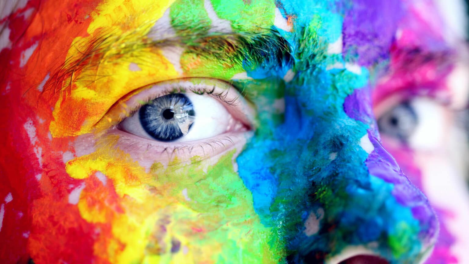
People make up their minds within 90 seconds of their initial interactions with either people or products and about 62?90 percent of the assessment is based on colors. When people need to make a decision, color seems to be a significant factor and color psychology, a branch of behavioral psychology, studies how color affects human behavior.
Blue
Most people depict blue as their favorite color. Therefore, this is the most commonly used color. Blue is a color of trust, peace, order and loyalty and as such it is the color of corporate America. Blue recalls the feelings of calmness and serenity. These features could prove useful on your website and landing pages. It is the color of the world’s biggest social network and many banks. Nonetheless blue should never be used for anything related to food since there is not much blue food.
Red
The most eye catching color is red. It is the color of energy associated with movement and excitement. It creates the feeling of urgency so it is often used for sale sign or buy now buttons. Very often it is used for advertizing food, for example the logo of the most famous drink ever. But red is not a good color to overuse since people when surrounded by red feel their heart beating a little faster and often report feeling a bit out of breath but using a spot of red in just the right place draws attention where needed.
Green
Green is the color of nature and the color of spring symbolizing constant renewal and regeneration. Many hospitals have rooms which have been painted green as patients “renew” or heal faster when this color is present. On the website which is focused on anything to do with nature, environment, organic, or outdoors, green is the color to go. Green is also considered as the color which can increase creativity and therefore it is often used for call into action buttons.
Yellow & Orange
The coloryellow personifies the Sun and some psychologists declare yellow to be the color of happiness. Others argue it is highly stimulating to excitement center in our brain which results with state of heightened emotion and response. All the ‘must see’ signs are painted in bright yellow: caution signs, taxi cabs, emergency service vehicles and heavy construction equipment but also website banners and pop up windows.
Orange is used by sports teams and children’s products since it helps to stimulate physical activity, competition, and confidence. Still, orange can be interpreted as “cheap.” Forbes Magazine posed the question, “Does orange mean cheap?” in an article on the “Effect of Color on Sales of Commercial Products.” The answer was “yes.” If you want the product you are offering to be seen as a bargain, orange may be a good choice.
Black & White
Black stands for elegance, sophistication and power and is exactly what luxury brands and high-end e-commerce look for. Any color can become the new black for a short time period but only black is timeless and classic. Websites for haute couture brands and expensive cars all have a black background with few details.
The impact of white should not be neglected. White is used to signify neatness, spaciousness and freedom. The most popular website in the world is basically all white. If there is a long text, black letters on the white background model on books and invite to read on.
These are some general guidelines but there are some additional things to keep in mind.
- Elements such as personal preference, experiences, upbringing, cultural differences, context, etc., often annul the effect individual colors have on us. For example the word for color yellow in China means that the thing it describes is pornographic and it will hardly evoke the sunshine effect.
- The brand needs to stand out among its competitors to get noticed so if all financial institutions use blue or green a bank with, for example, a black and yellow logo will be easily distinguished.
- Website should present the nature and the essences of the brand. The choice of color should authenticate the brand and the values it stands for. There are millions of colors out there, but the website colors should represent its business and mission.
Wise choice of colors will not only make the products differ from competitors, but also provoke feelings – positive or negative – and create attitude towards certain products. Human feelings and moods are easily changeable and since colors play roles in forming attitude we should be aware of the color impact in marketing.
